SAM GREY
FRONT END WEB DEVELOPER


HOW I DID IT
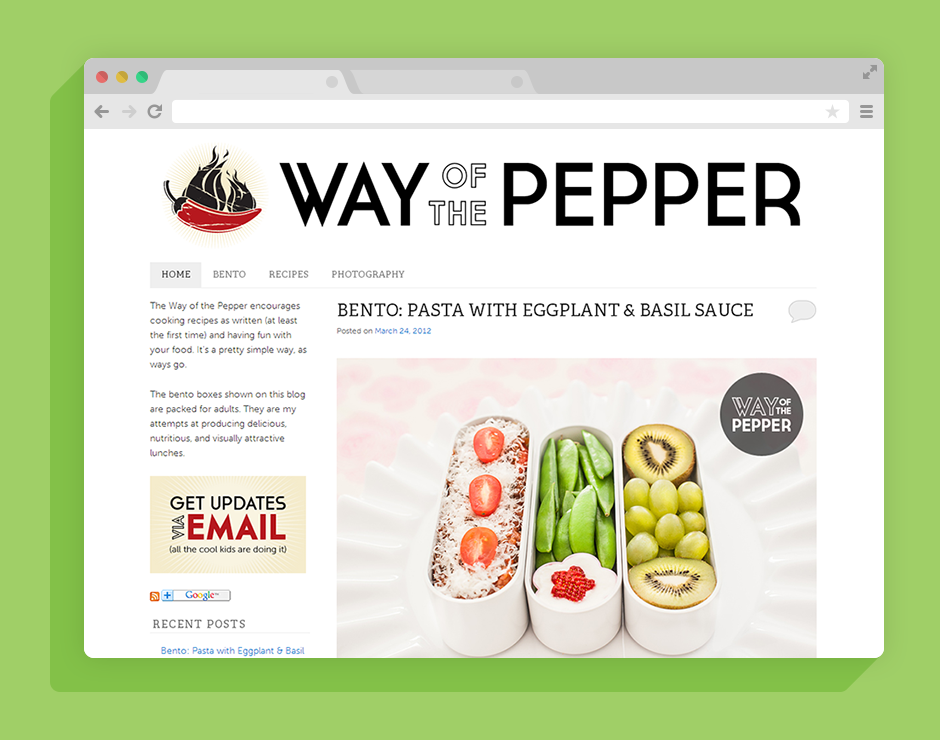
I started with the brand identity of the blog: after some brainstorming and rough sketches, the logo, header, and visual look quickly came together with the help of some licensed stock vector images.
WordPress is an obvious choice for the vast majority of blogs, and in this case, I chose to start with the Twenty Eleven theme. I created a child theme to allow me to make significant changes to the feel and functionality of the original theme. I stripped out a considerable amount of visual clutter in the original theme, and then worked on perfecting the typography for this website. With such a bare-bones approach to the design (to draw the viewers eye immediately to the photographs), it was crucial to get the text layout looking perfect without being overly fussy or immediately obvious.
LOOK FOR:
Primary emphasis: The photographs.
Supported by: Very clean typography set in a no-frills layout, along with a very intuitive navigational schema.
Subtle Touches: The tactile feel of the clickable links in the live project.
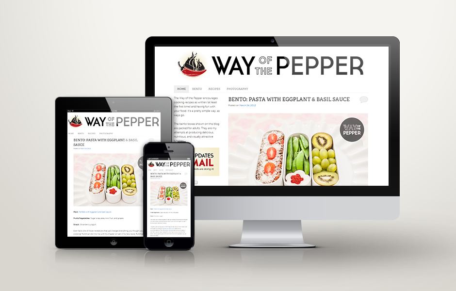
Responsive Design: The blog renders beautifully on a number of screen form factors.
Effective Marketing: The blog layout includes no ad space by design. Given the recent shift towards highly targeted email marketing, the sole call to action on the website is for the visitor to join our email list, so as to not miss out on any updates.